Make Your Walls Beautiful with These Pastel Shades

 Jul , 2026
- Berger Speaks
- 4 Min Read
Pastel walls can change the mood of a home without making it loud or overdone. These gentle colours suit Indian apartments, compact bedrooms, rented homes and villas by softening light and reducing clutter. Before choosing pastel colour shades, consider room size, sunlight, flooring and daily use. A suitable pastel can stay pleasant for many years in India.
Why Choose Pastel Shades for Your Walls?
So, what are pastel colours? Typically, they are softer versions of regular colours. For walls, this means a colour that feels calm but not plain. Pastel colours for walls brighten rooms, match furniture easily and give homes a clean charm.
Create a Bright and Spacious Look
Light pastel shades reflect daylight better than deeper colours. Where balconies, grills or nearby buildings block sunlight, soft blue, cream, peach, or mint can make rooms feel open. They also reduce the boxed-in feeling that dark walls create in small bedrooms.
Bring a Calm and Relaxing Atmosphere
Pastels help where the home needs a quieter mood. Bedrooms, prayer corners, study nooks and family sitting areas benefit from shades that do not compete with the eyes.
Easy to Pair with Different Décor Styles
Pastel walls adjust well to modern, wooden, cane, marble, metallic and fabric-heavy interiors. A good colour catalogue can show how one pastel behaves beside beige curtains, grey sofas or patterned tiles.
Best Pastel Shades for Every Room
The best pastel aesthetic room colours support how the space is used every day.
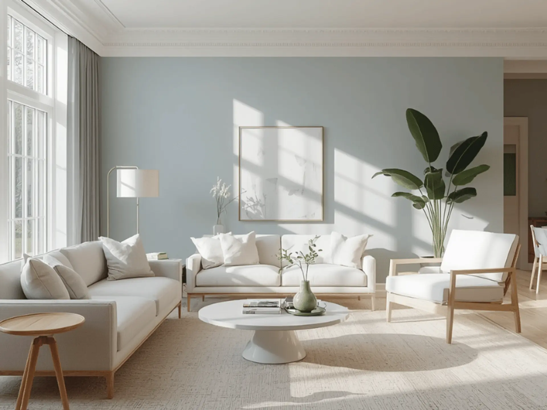
Soft Blue for Bedrooms
Soft blue creates a cool, restful bedroom. It works with white linen, light wood and grey accents. Homeowners often search for how to make blue colour softer on walls, and the answer is a diluted blue.
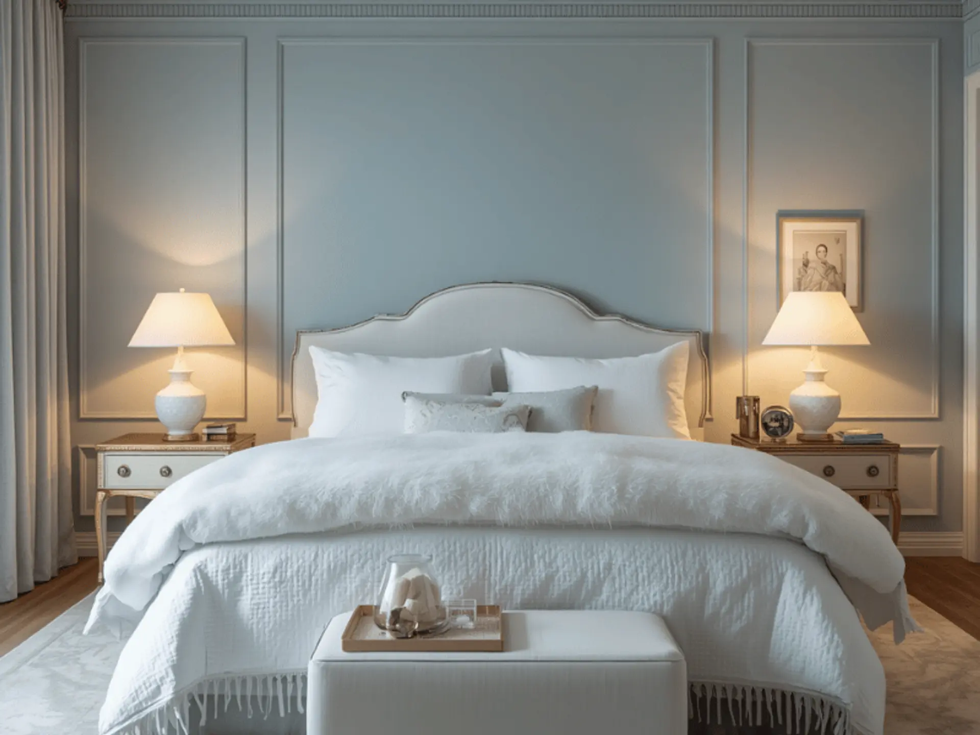
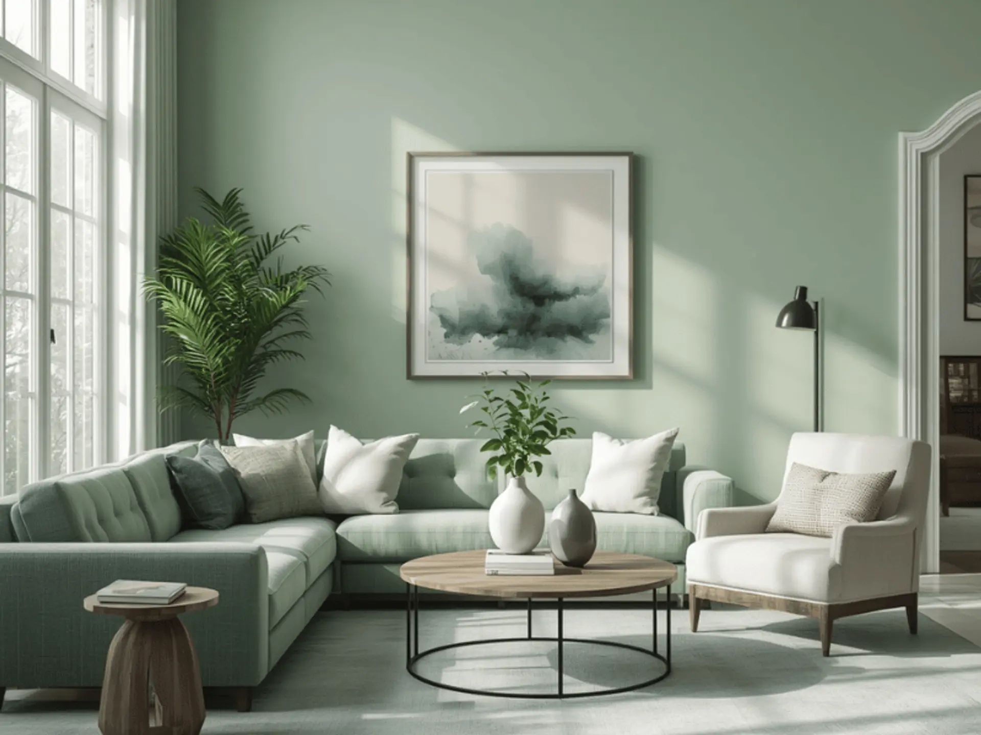
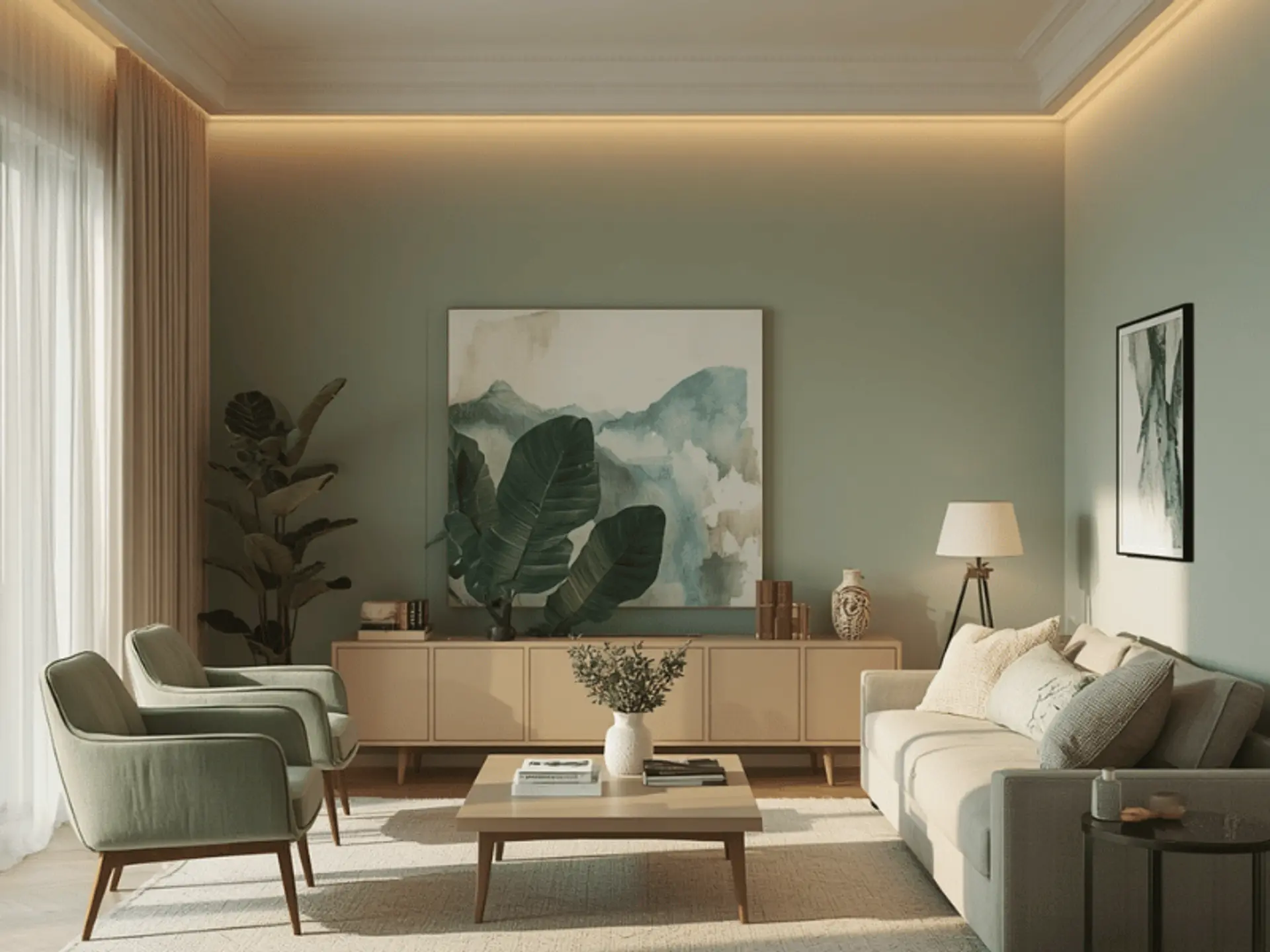
Mint Green for Living Rooms
Mint green brings freshness to living rooms without feeling too bright. It pairs with indoor plants, cane chairs, beige rugs and warm lights. It is practical for flats where the living room handles guests and family time.
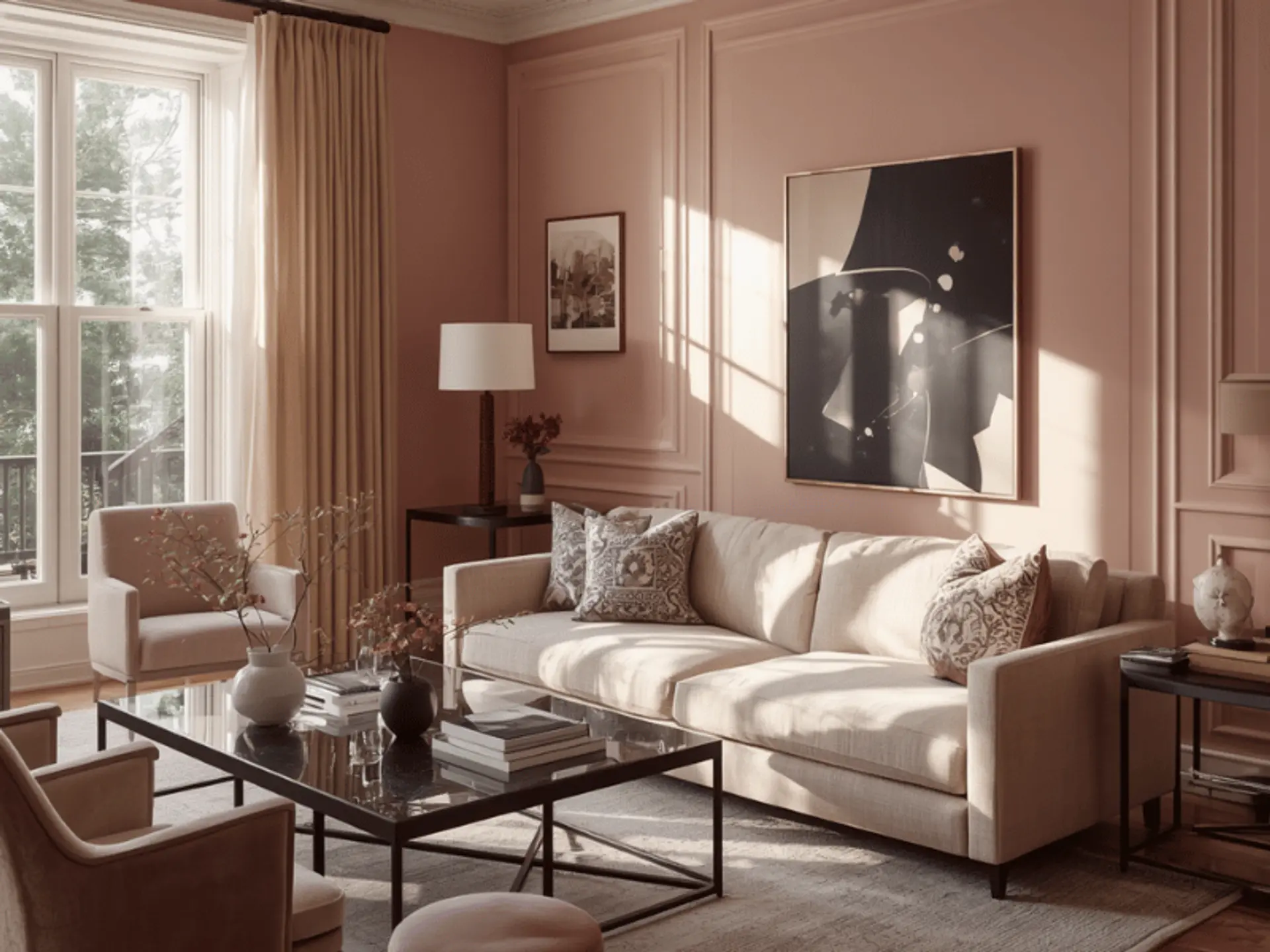
Blush Pink for Accent Walls
Blush pink adds warmth without turning the room overly decorative. Use it behind a bed, console unit or dining side wall. Balanced with white, cream, walnut or brass details, it feels elegant rather than sugary.
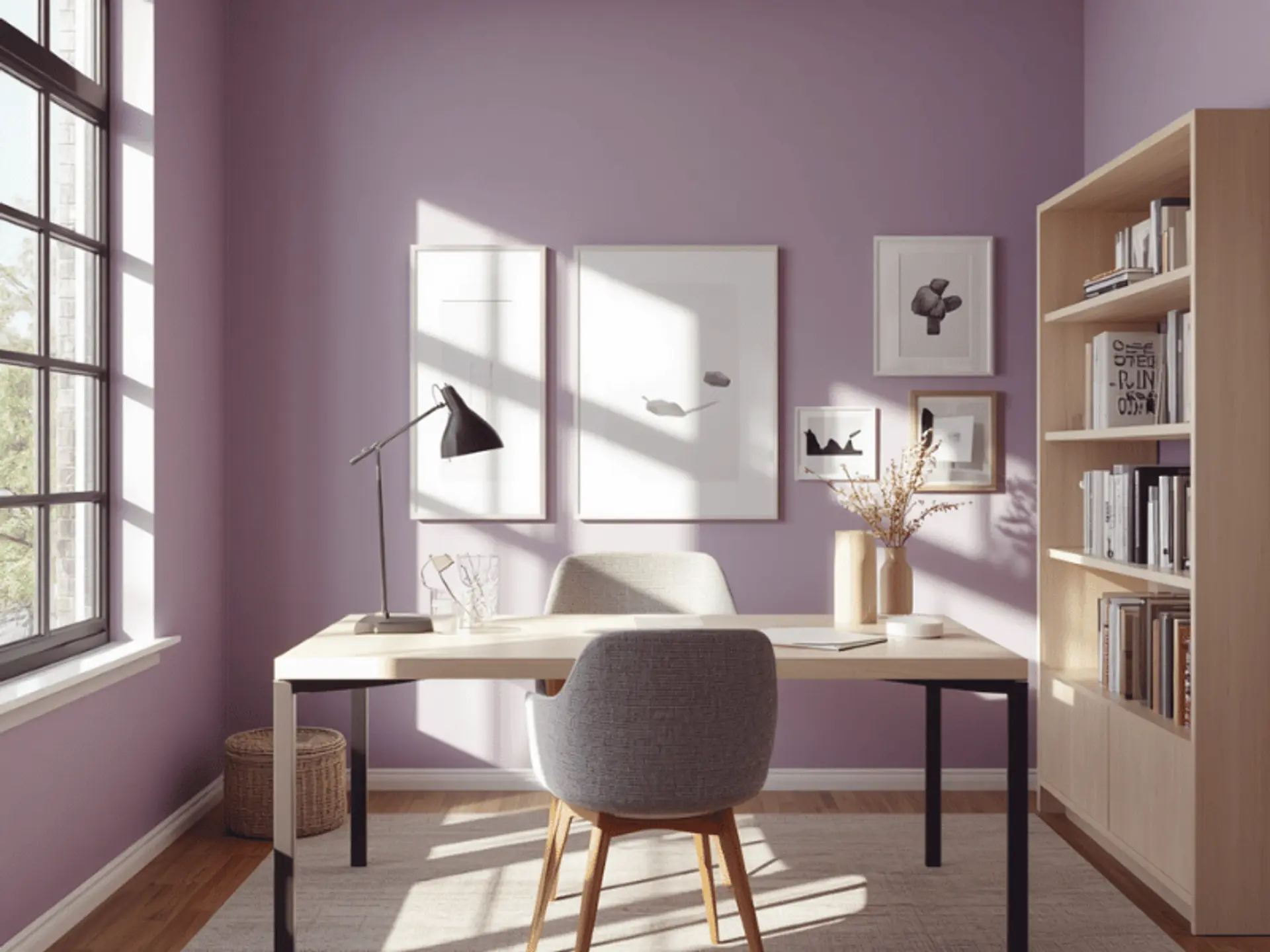
Lavender for Study Rooms
Lavender has a soft, creative quality, making it suitable for study rooms or work corners. Keep the shade muted so it does not distract during long working hours. Pair it with white shelves and warm task lighting.
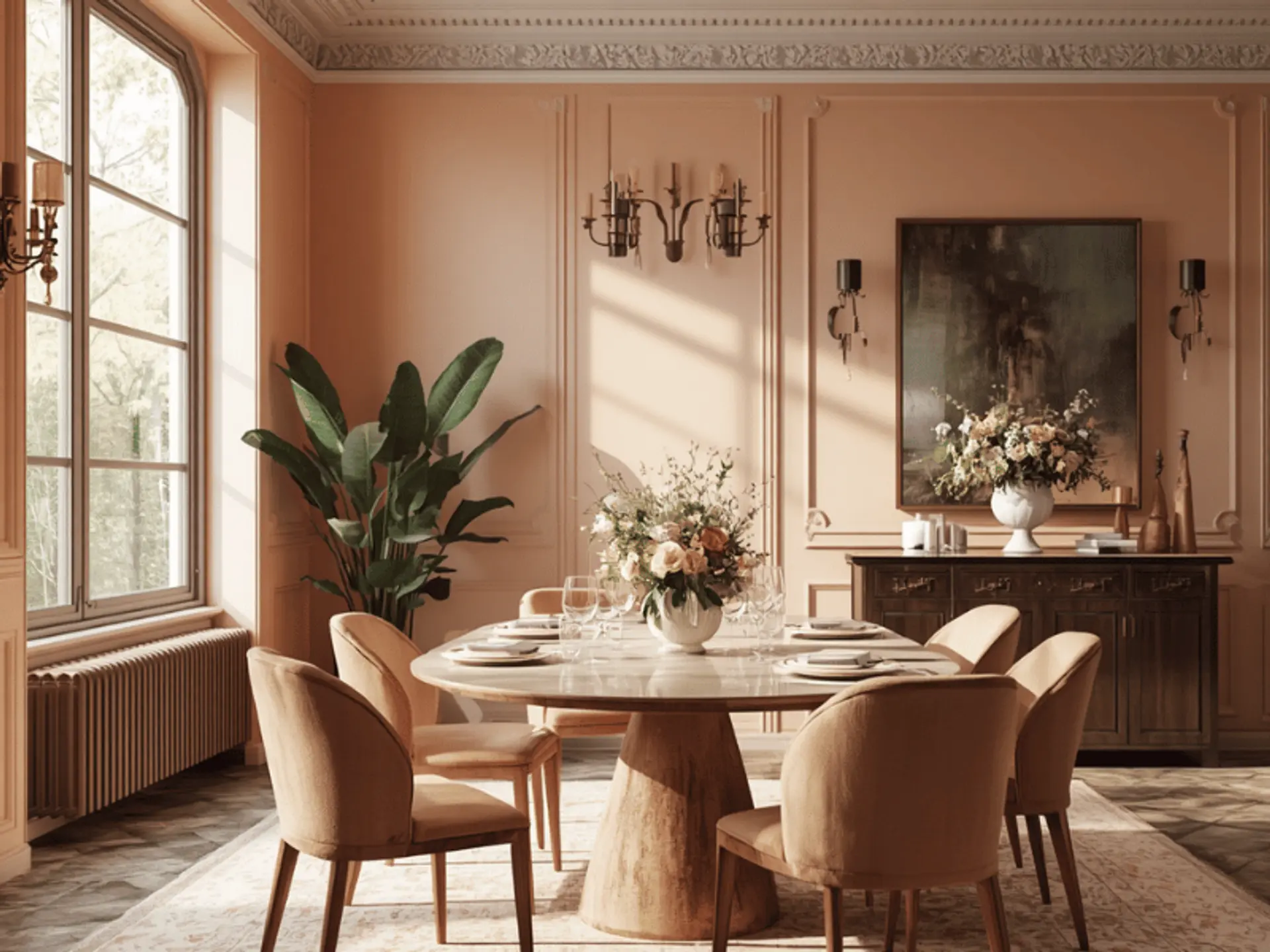
Peach for Dining Areas
Peach makes dining spaces feel welcoming. A thoughtful peach colour combination for walls can include cream, off-white or light wood, helping the dining area feel cosy without becoming heavy.
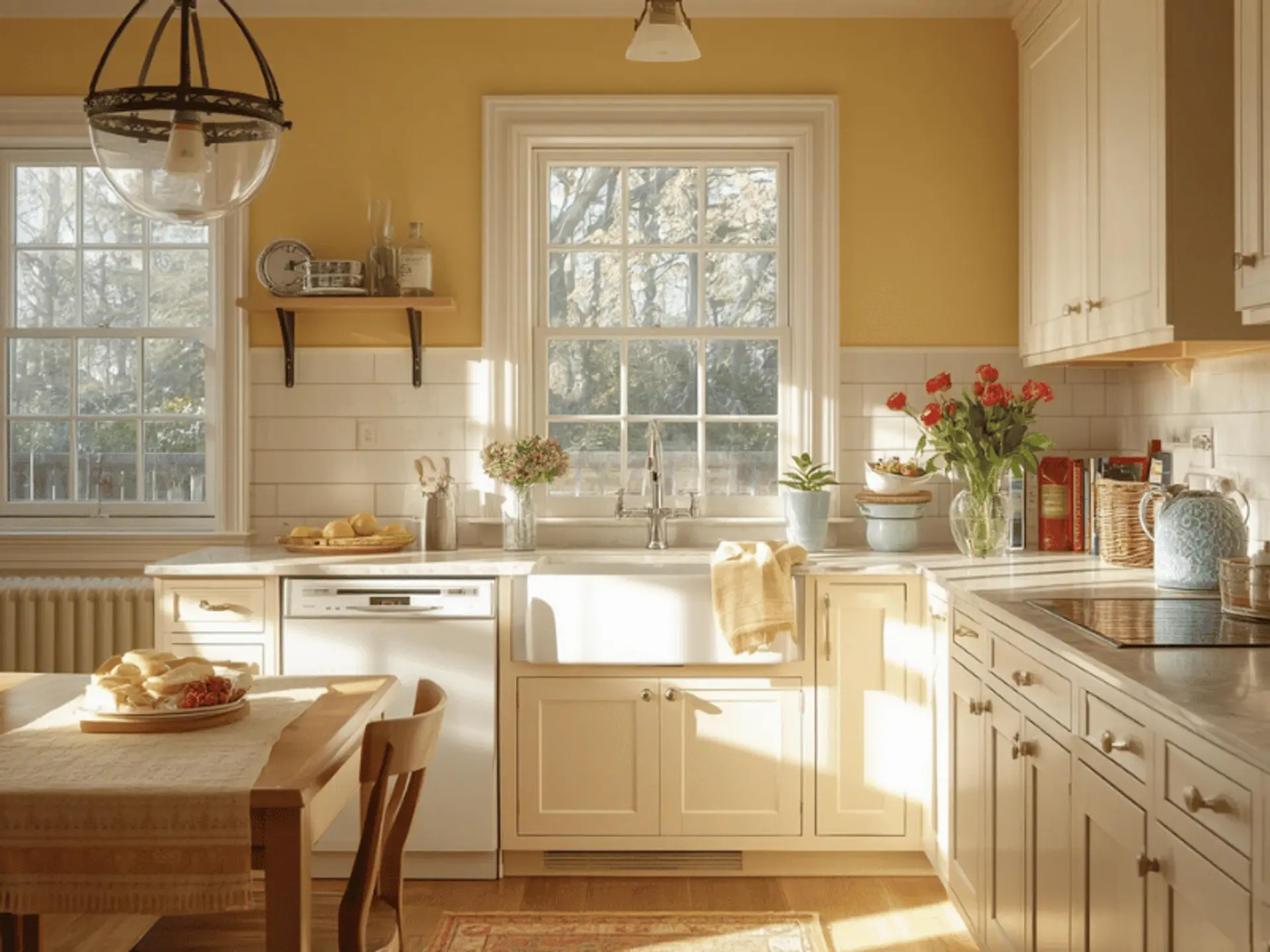
Butter Yellow for Kitchens
Butter yellow is cheerful but gentle. It suits kitchens that need brightness, especially where natural light is limited. Use washable wall paint here, because Indian kitchens face steam, oil marks and frequent cleaning.
Popular Pastel Colour Combinations for Walls
The right colour combination of pastel wall colours should consider flooring, ceiling, curtains and furniture together.
Blue and White
Blue and white feel fresh and airy. It is reliable for bedrooms, children’s rooms and coastal-style interiors. Keep the blue soft and use white on trims or ceilings for a cleaner finish.
Mint Green and Beige
Mint green with beige gives a natural, earthy mood. It suits living rooms with plants, wooden furniture and woven textures. This combination is gentle enough for daily use and still has character.
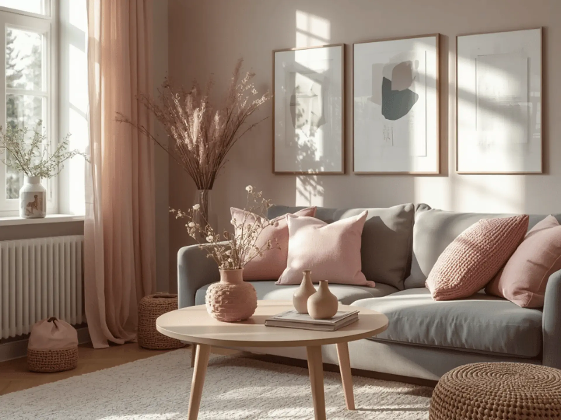
Blush Pink and Grey
Blush pink with grey gives a neat contemporary look. A soft grey colour combination for walls can tone down pink and make it suitable for adults’ bedrooms, dressing areas and compact lounges.
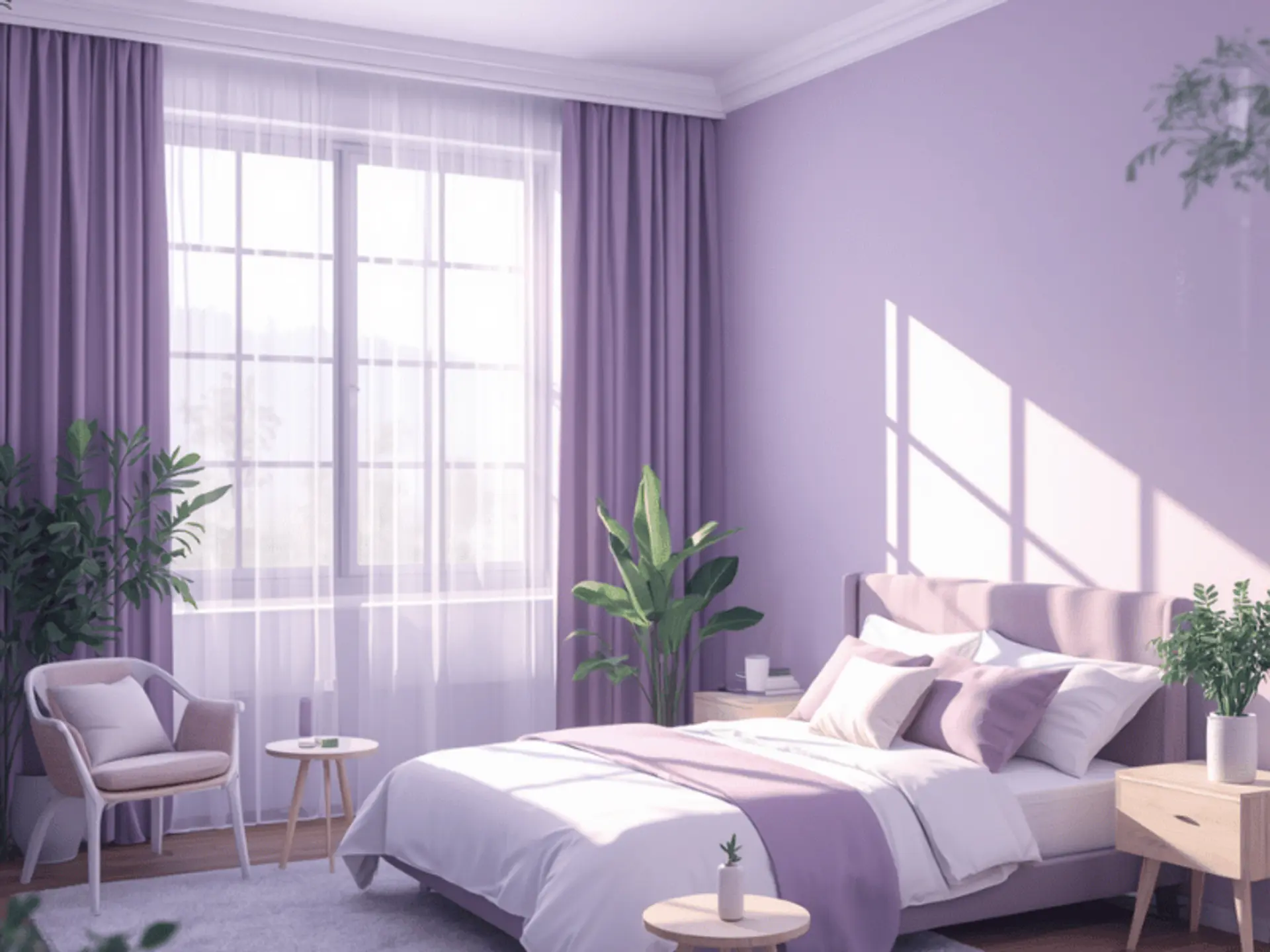
Lavender and White
Lavender and white can feel peaceful when used carefully. It works best where the room has enough light, as dull corners may make lavender look flat. White furniture keeps it crisp.
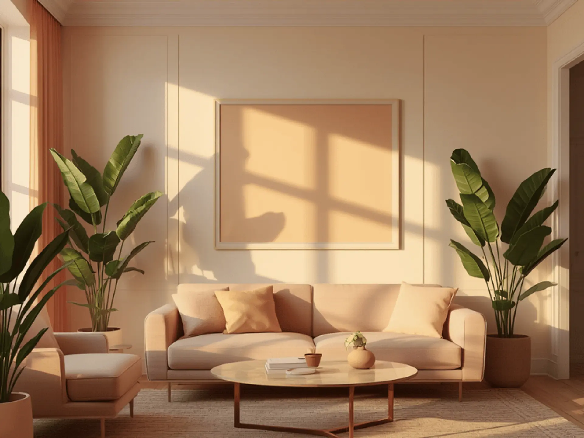
Peach and Cream
Peach and cream are warm, friendly and easy to live with. It suits dining rooms, guest bedrooms and family spaces. Add wooden frames, beige upholstery or terracotta décor for depth.
How to Choose the Right Pastel Shade for Your Home
Choosing a pastel shade is not only about liking a colour on a shade card. The same colour can look different once it is applied to a wall, especially in Indian homes where sunlight, flooring, furniture and room size vary a lot. Before finalising the shade, look at how the room is used, how much light it receives and what elements already exist in the space.
Consider Natural Lighting
Morning light, afternoon glare and tube lights can change a pastel’s appearance. Paint a small patch and observe it for a day. In humid cities or dusty areas, choose finishes that are easier to wipe.
Match Existing Furniture and Décor
Your wall colour should sit well with curtains, flooring, sofa fabric, wardrobes and artwork. Rented homes can use softer neutrals because they work with mixed furniture. Owned homes can try personal pastels on feature walls.
Choose Based on Room Function
Bedrooms need restful colours, living rooms need balance, kitchens need freshness, and children’s rooms need cheerful softness. For traditional preferences, a Vastu-approved living room combination in light green, cream or soft yellow may suit belief-led planning.
Tips for Decorating with Pastel Walls
Pastel walls look best when the rest of the room supports their softness instead of competing with it. The décor should add balance, contrast and texture so the space feels finished, not plain. A few thoughtful choices in furniture, fabric, plants and accessories can make pastel walls look more elegant and lived-in.
Add Neutral Furniture
White, beige, oak, walnut and grey furniture support pastel walls beautifully. Avoid filling the room with too many soft shades. One clear base colour and one pastel usually work better than many similar tones.
Introduce Textures and Patterns
Pastels need texture to avoid looking flat. Use cotton curtains, woven rugs, linen cushions, fluted panels, framed prints or ceramic accessories. Patterns should be small, so they do not overpower the gentle wall colour.
Use Indoor Plants for Contrast
Green plants bring life to pastel interiors. They stand out against peach, blue, pink and cream walls while making the space feel fresh. This helps urban homes where outdoor views may be limited.
Conclusion
Pastels remain timeless because they bring colour, light and comfort without overwhelming a home. From bedrooms and kitchens to living rooms and studies, pastel shades colour choices can suit Indian weather, furniture, space limits and personal taste. Test shade cards, see colours in actual light and plan combinations before painting. For a professional finish, Berger Express painting services can support with expert colour consultation, surface preparation and neat paint application, helping your chosen pastel shades look beautiful for years.
check for any query you have about the blog
Frequently Asked Questions
Yes. Lighter pastels reflect more light, so rooms feel bigger. Soft blue, mint, cream and pale yellow suit compact rooms.
Lavender, pale green, powder blue and warm cream work well. Choose a shade that feels calm and screen-friendly.
Butter yellow, mint green, light peach and soft cream suit kitchens. Use durable, washable finishes.
Yes. Pastel accent walls work behind beds, dining consoles, study desks and TV units.