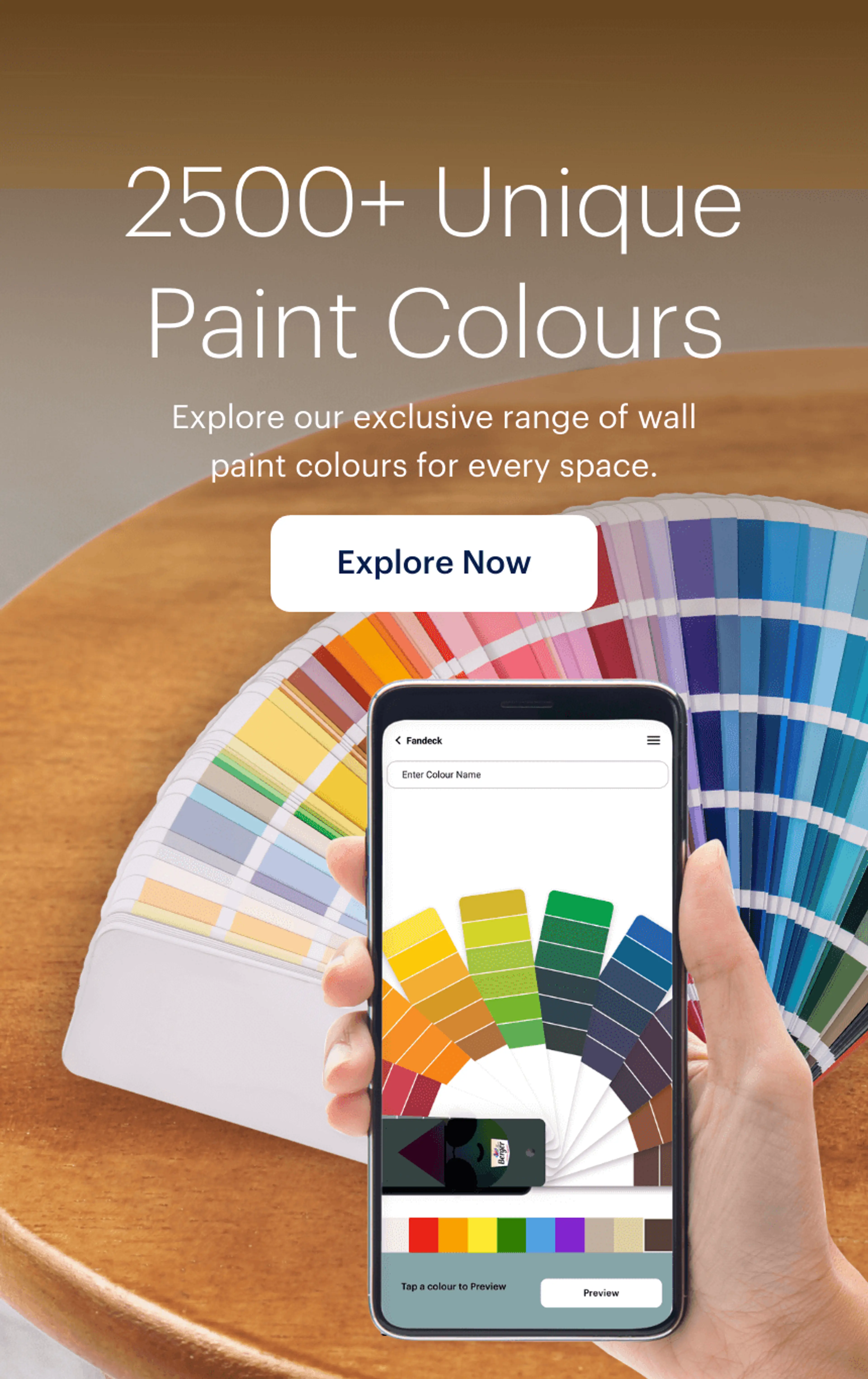
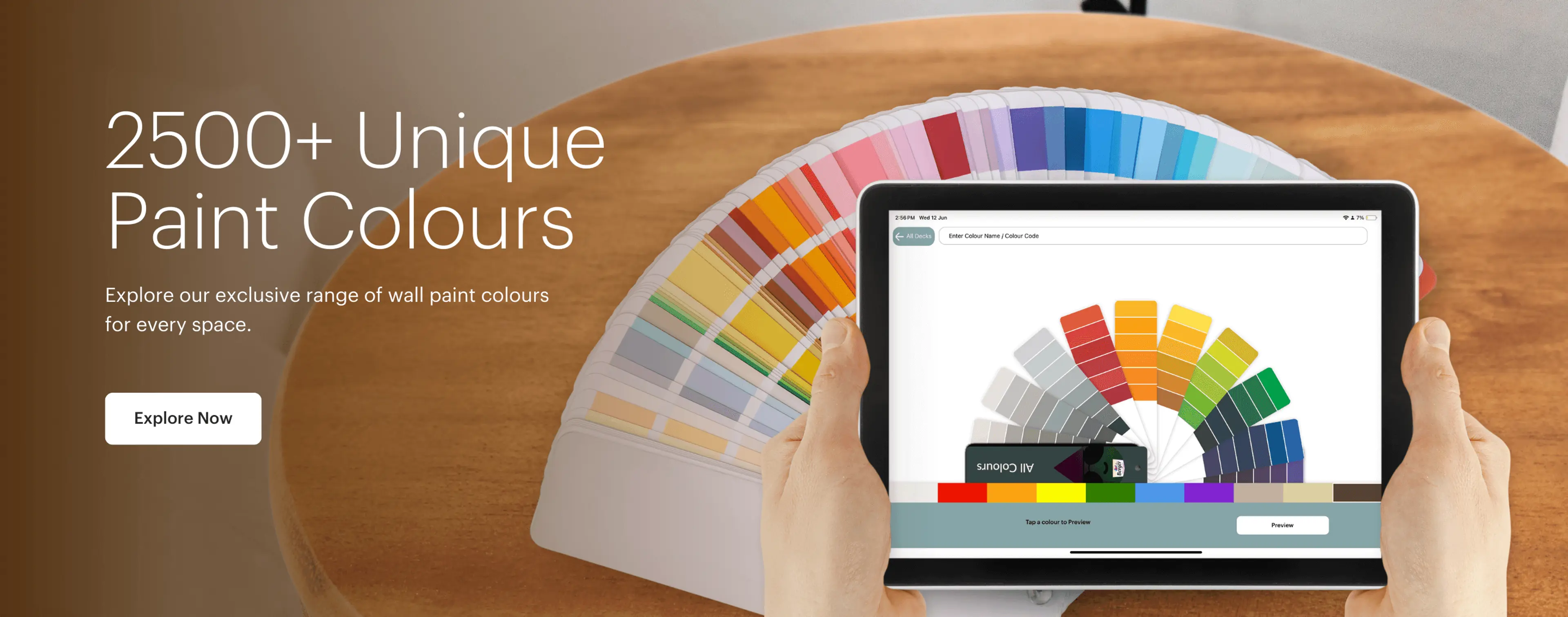
Colour Catalogue - Colour Shades and Cards
Choosing the right colour palette is key when decorating your home. While finding the perfect wall paint shade can be frustrating, a well-organized colour catalogue makes browsing and selecting from a wide range of shades quick and easy
- Reds
- Oranges
- Yellows
- Greens
- Blues
- Violets
- Earth Tones
- Classic Neutrals
- Dark Accents
- Whispering Whites
Explore the Berger Paints Colour Catalogue
Explore the Berger Paints Colour Catalogue to discover a wide array of paint shades for walls that can bring your vision to life. Whether you're searching for the perfect colour for walls to create a specific mood or experimenting with different wall colour combinations, the catalogue is your ultimate guide. It provides an extensive selection of colours and combinations, helping you find the ideal match for every room in your home.
Colour Selection Guide
The room paint colours you pick have to go through a methodical process in order to avoid making costly mistakes.
First, you need to start by gauging the amount of sunlight the room gets and noting the size of the room. For smaller rooms that receive less light, go for light wall colour shades like off-white, white, beige, etc. The best light colour for home is white with a matte finish.
For bigger rooms with large windows or a balcony, you can experiment with darker room paint colours.
You can also easily identify the most suitable colour shades with names from the extensive wall paint colours catalogue with the help of the smart Colour Finder tool.
Try Our Colour Visualiser
Do you know a smart way to protect your investment and get the best colour palette for your entire home? Test out unlimited room paint colours, wall colour shades, and paint colour combinations with Berger Paints’ smart Colour Visualizer.
With the help of the smart Paint Calculator tool, you can get an estimate for the total amount of paint every room will need.
Explore The Latest Colour Trends
While the classic interior paint colours are amazing, it’s fun to experiment with modern texture paint designs and paint colours for home – from the demure light grey colour or pastel colour palette to the more striking red or yellow room paint colours.
Take the help of the Berger paints shade card because you will find that the Berger interior paint catalogue PDF is updated regularly and contains all the trending colour shades with names.
Speak With Our Colour Experts
Level up your colour palette by consulting with the experts. From interior to exterior wall paints, consult with professionals to make sure that you don’t make a costly mistake in your long-term investment.
Frequently Asked Questions
Like any other decision, when you want to decide the right colour palette for your home, you need to start with practical considerations. In this case, they are the size of the room, the amount of sunlight the room gets, what the room will be used for, and of course, your budget.
Next, you come to your paint colour preferences. Do you like dark paint colours for home or are you looking for the best light colour for home? Each one of the above details will decide the colour code you should go for.
For example, let’s assume you want to select the right wall paint colour for your bedroom. The room is relatively big with a medium-sized window. In this case, you can explore the darker bedroom Berger paints colour shades for one wall combined with lighter colours for the other three.
The latest wall paint colour trends are all about elegance mixed with a little bit of fun. A colour palette like light grey and red, with red being used in moderation. Another wall colour combination that is in vogue is the use of pastels combined with either light brown or beige.
Basically, it is about stepping away from the classic wall painting colours like white and off-white but retaining the lighter colour code.
However, not every trending wall paint colour catalogue promotes light wall colour shades. There are a few combinations that go for elegance in another form – by choosing room paint colours like dark purple or dark brown. But in this case, the rooms are mainly larger in size, and their beauty is increased with the help of well-placed and cleverly picked lighting. This type of up-and-coming colour palette definitely shouldn’t be opted for without first going to consult home painting experts.
The right colour palette for your home walls has to balance practical factors as well as personal preferences. To understand your options, we start by first browsing through an interior paint colour catalogue/Berger paint colour chart.
Once you have finalised your choice from the vast wall paint colour names list, you can match the most suitable wall colour shades with each room. For example, smaller rooms with small windows do well with the best light colour for the home as a light wall colour reflects more sunlight and makes the room feel bigger and brighter – even cleaner, in some cases.
For a room like the living room/hall, lighter room paint colours work better at creating a welcoming environment that you want in a common space where you will be entertaining guests. As opposed to this, the room paint colours in the home office should successfully promote focus and help in reducing stress levels – which can be achieved by either balancing light and dark colours or going for light pastel shades.
Like any other professional painting service in India, Berger Paints has wall colour experts and professionals with certifications to help you pick not just one paint colour but also create a colour chart for your home and provide custom colour code suggestions for your entire home.
However, what sets Berger Paints apart is that they also provide smart tools to help you understand colour theory and narrow down your preferences when it comes to the colour for the wall.
- Colour Finder: One website calls it dark brown and another calls the same shade “mahogany”. It’s confusing and frustrating – but the smart Colour Finder tool will solve all these problems. With the click of a button, an extensive colour shade card is available at your fingertips. Here you can easily explore hundreds of colour shades with names, making your process of colour selection easier and quicker.
- Virtual Painter: Now that you have identified a colour or two, how do you know if the shade will look as good in real life as it does on your screen? The smart Berger My Colour, a virtual painter tool, will help you paint your walls using your choice of colour code – all for free!
- Paint Calculator: Colour preferences aside, budget is a major deciding factor when it comes to home painting. Get an estimate beforehand for every texture paint, colour shade, and finish with the help of the Paint Calculator tool.
The fact that room paint colours define your mood in the room is backed by science. Research also shows that the same colour palette that works in the living room might not be the most suitable one for your bedroom, and vice versa. That’s because, the purpose of the two rooms is entirely different, and the first and most important aspect that sets the tone in the room is the wall colour.
When you start a home painting project, you have in front of you a long list of wall colour shades that you select your favourite ones from. But there’s no way of knowing what a specific colour for a wall will actually look like. There is also the question of whether or not the wall paint colour will look good at different times of the day with the changing light of the Sun. Lastly, you also need to match your choice of wall colour with the colour palette of the entire room, which includes selecting the shade that will complement your furniture, curtains, etc.
The only time you can see if it has all worked out is after the painting is completed – which is too late. Imagine if you realise that the colour that looked fresh and nice in the colour shade card looks entirely different once applied to the room walls. That’s a costly and frustrating mistake to commit and not something that can be easily undone.
To avoid all that trouble, Berger Paints came up with a smart AI tool – the Berger Paints Colour Visualizer. This tool helps you see what a wall paint colour will look like even before you start the painting. And you get it for free!
Experiment with hundreds of wall colour shades, paint finishes, and texture painting with the help of this smart AI tool from Berger Paints.
The best colour shade card is one that fits the following criteria:
- Wide Range of Colour Shades with Names: A good colour shade card should contain lots of different room paint colours. It needs to include all kinds of wall paint colours in different finishes, from very light to very dark. The card should also show different finishes like matte or glossy.
A modern wall paint colour catalogue will also contain a list of textures.
- Correct Wall Colour Shades: The colours on the colour shade card should look almost the same when you actually paint your walls. This avoids shock and disappointment at a later stage and promises greater levels of customer satisfaction.
- Easily Available Colour Code/Reference Number for Each Shade: Each colour in the wall paint colours catalogue should have a unique colour code. This makes it easy to choose, order, and find the same wall colour shades later when you need to buy more later on.
To choose a colour for the wall, start by thinking about the kind of vibe you want to create. Do you want to create a fun and childlike atmosphere? Then go for a bright bedroom Berger paints colour shades like pastel pink, yellow, or green. For a more sombre look, go for a demure colour palette, like one with navy blue, mahogany, charcoal grey, and so on.
It is also important to note the vastu room paint colours and choose shades that are positive.
A good wall paint colour catalogue will have a wide range of wall colour shades in different finishes. This will give you a good idea of what different shades and finishes will look like.
The best bedroom Berger paints colour shades are a combination of functionality and aesthetics. When it comes to the practical aspects, you need to think about who will be using the bedroom. For kids’ bedrooms, the walls tend to be more prone to stains and spills, be it from crayons or food. For such bedrooms, go for the kind of paint colour that won’t reveal marks and stains as easily as say, white wall paint colour in a matte finish.
However, if it is any other bedroom, you should start by thinking about the kind of vibe you want to go for based on the size of the room. For a smaller room with small windows and less natural light, go for wall colour shades like white that will make the bedroom seem bigger and brighter. The best light colour for your home is usually one that reflects light but is not prone to stains and marks on walls.
A colour code is a unique number or letter combination for a specific paint colour. Every wall paint colour has its own colour code, which helps you find the exact same shade if you need more paint later. When you want to select wall colour shades, the colour code is important because it helps you get the exact colour for the wall that you want.
Without a systematic colour code, you will fail to identify the exact colour because all the different wall paint colour brands have their own colour shade card. So, in case you like a colour with one brand and at a later stage want to buy the exact same shade, without the colour code, it’s a guessing game. You might even be forced to browse through a wall paint colour names list with thousands of similar-looking shades.
Modern homes and modern home decor are embracing minimalism and simplicity when it comes to the colour palette. Today, neutral and pastel wall colour shades are the most popular choices for room paint colours.
So, if you want a clean, minimalist look, go for neutral paint colours for your home like light grey or beige. If that feels too plain or boring, add a pop of colour either in the form of an accent wall where you paint one wall out of the four in a different, more colourful shade, or you can add a colour like red, pink, or yellow in small furniture pieces like sofa or chair cushions.
If you want to create a specific vibe like a beach, go for sandy room paint colours like beige and mix it up with pastel blue.
Selecting individual room paint colours for everything from furniture to curtains to walls, and then throwing them all haphazardly together creates a chaotic atmosphere. And quite possibly the opposite of visually appealing. To avoid this exact situation, interior decor experts recommend previewing a colour palette before finalising your decision. However, this isn’t free and most people don’t have the budget to invest in such services.
Don’t worry! Berger Paints comes to your rescue with a smart tool that allows you to experiment and preview a colour palette – all for free!
The professionals at Berger Paints have created the Berger My Colour virtual painter app that brings your ideas to life. Now you can see what your choice of wall colour shades will look like on the walls of your home in just a few clicks!
You can easily find wall paint colour catalogues on the official websites of trusted paint brands like Berger Paints. Not only is the entire Berger interior paint catalogue PDF available online - you can access it for absolutely free!
The reason why we recommend referring to trusted paint brands is that not all wall paint colour catalogues are the same. Depending on the brand, everything from the shades of the same wall colour to the number of options available when it comes to different textures, changes based on the source. What makes this catalogue/Berger paint colour chart reliable is the fact that the colours you see here are exactly the way they will look in real life, on the walls of your home. Plus, you get to go through the entire wall paint colour names list and you don't end up settling for your second favourite colour because you couldn't find the exact match.
According to Berger Paints, the best wall colour shades for a home depend on each room’s size, lighting, and your personal style.
For small-sized rooms with small windows, Berger Paints recommends going for colours like white and beige. The best light colour for home is off-white in either a matte or soft gloss finish.
As for bigger rooms, room paint colours like charcoal grey, navy blue, dark green, and mahogany are worth exploring.
For each of the above colour palettes, Berger Paints highlights the importance of balance. Be it light or dark wall painting colours, there needs to be a healthy balance. That means, if you're going for a beige colour palette, add hints of a bright wall colour like red, yellow, or green. The same applies to a dark colour palette as well where you may need to tone down the shades with the help of contrasting wall colour shades.
A colour chart is nothing but a big sheet or book that shows you different paint colours. To make it easy for customers to find their favourite shade of a particular colour, the chart is organised in a smart way. Each section has different shades of a specific wall paint colour. This division helps you flip through the options faster and streamlines the wall colour selection process which is otherwise very complex and frustrating.
It’s important to refer to a colour chart because room paint colours tend to look very different in your head compared to the way they’ll actually appear on your home's walls.
Using a colour chart is pretty simple. Browse through the colour selections and identify the colour family you want to go for - this could be as broad as "green" or "blue". Next, compare the lighter and darker colours. Note down the colour code of the shades you like the most.
Lastly, use a virtual painter to see how the selected shades will look in your home.
You can view the Berger Paints shade card on the official website or on the Berger Paints mobile app. Here, you will be able to explore all the wall painting colours in a digital format, and you can also download the Berger interior paint catalogue pdf to browse offline.
While there are many different solutions to this common problem, we're all about efficiency. We carefully studied all the solutions, post which we can confidently say that this is the easiest, quickest, and cheapest way to select the wall paint colour of your dreams from nothing but a list of names.
To select the best, most suitable wall paint colour from hundreds of names on a list, start by using a smart tool like a colour visualiser. Here, you will see what a colour will look like in real life, on the walls of your home. This is a great way to efficiently eliminate the shades you don't like and consider ones that maybe did not seem as promising on the Berger Paints shade card.
From the classic room paint colours like white to the popular wall colour shades like light grey to the more recently trending pastel paint colours for home, you have many different bedroom Berger paint colour shades to explore.
If you want a calm bedroom, you need the best light colour for home - shades like pastel blue, pink, or even yellow as seen in the bedroom Berger paints colour shades, are the answer you're looking for.
The catalogue/Berger paint colour chart also includes texture options to help you understand what a particular colour or shade will look like in a specific texture. If you think textures don't matter, the shades catalogue/Berger paint colour chart will make you rethink that. That's because even white in a matte finish will look entirely different from white in a marble texture finish. That's because light reflects differently based on the paint colour texture, causing our senses to perceive each one differently.
The best light colour for the home is usually a shade of white, cream, or light grey. These wall colour shades reflect sunlight and make rooms feel bigger and brighter. Berger Paints offers many paint colour options in this range, like “Off White,” “Ivory,” and “Morning Mist" that fit this criterion.
You can find these light shades in the Berger Paints shade card or view them in the wall royal colour shade card to pick the one that fits your home best.